I just came across an excellent post from Joel Spolsky on anecdotes disguised as scientific facts:
Whether it’s Thomas Friedman, who, it seems, cannot go a whole week without inventing a new fruit-based metaphor explaining everything about the entire modern world, all based on some random jibberish he misunderstood from a taxi driver in Kuala Lumpur, or Malcolm Gladwell with his weak theories on tipping points, crazy incorrect theories on first impressions, or utterly lunatic theories on experts, it all becomes insanely popular simply because the stories are fun and interesting and everybody wants to hear a good story. Spare me.
“Fruit-based metaphor.” I like that.
While we’re on the subject of pseudo-science, we might as well cover the “pedagogic graph”. The pedagogic graph is used to illustrate an idea, rather than display any actual data. A great example is the Laffer curve, used to illustrate how lowering taxes actually increases tax revenue. It doesn’t illustrate any empirical evidence of course, it’s just a great curve.
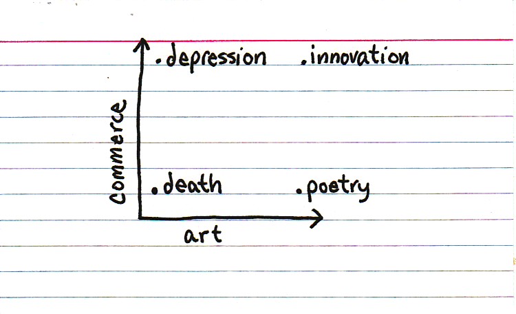
A close relative to the pedagogic, non-empirical graph is the Pointless Diagram. I’ll leave that to the excellent Indexed blog: